Kathleen Finnegan
Home(818) 601-0056
throwing shade: picking the perfect paint color
 I see a lot of interiors and whether your buying or selling a home, paint is always a topic of conversation. I read this article recently that talked about great ways to approach painting a room, or multiple rooms, in your home. Some of the tips are great for design in general.
Painting your walls is one of the easiest ways to transform the look of your living space. What is not so easy is selecting the perfect colors. The choices are seemingly infinite, and trying to picture how particular shades will look and work together in your apartment or condo can be a challenge. But the process doesn’t need to be overwhelming. Check to make sure you’re allowed to paint your unit, then follow these basic guidelines for selecting shades..
Most people want to slap on a coat of paint before they do anything else to a room. But I always advise clients to build a room around the colors in the furnishings, curtains and rugs. These often have patterns and color combinations you wouldn’t necessarily put together on your own, and they can be your jumping-off pointAnd if you don’t work with your fabrics and furnishings, they can compete with the wall color. With the many paint apps out there, it’s easy to color-match a pattern to any can of paint. You can also bring a fabric sample to the paint store to scan there.
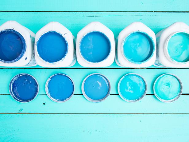
Go cool or go warm, and stick with it.
You can use multiple colors in a small space or in adjoining rooms, as long as you do one thing: Stick with either cool tones or warm tones in every color. Gray with brown undertones, for example, is a warm taupe. If the undertones are purple, the gray will be more of a cool lilac. Mix those two shades and the result will be disharmony. But use the warm taupe gray in one room and a warm olive in another and you’ll get a good flow between the rooms.
Consider the lighting.
I always paint three 2-by-2-foot samples side by side on each wall before painting a whole room. I’ll paint the color I want, plus one shade darker and one shade lighter next to it. That’s because lighting can change everything and you have to see a color on the wall to know for sure how it’s going to look in a room. If you’re in a kitchen and your light source is fluorescent, the hue is going to have a blue tint to it. If you’re in a room with no natural light, your color is going to appear much darker than in the paint aisle. If you’re going for a dark color, make sure you have enough natural light in the room or your small space will turn into a cave.
Make one thing the star.
If you want a bold wall color and have put up a sample and love the way it feels, then keep your furniture neutral. Choose grays, whites and creams and let the wall color be the star. Sometimes even just a thick stripe or feature wall is all you need with a saturated color.
As you choose paint colors for your home, remember that apartment- and small-space living is often transitional. This can be a time to explore interesting choices. As long as you stick with colors that make you feel good, you can take a few chances. It doesn’t have to be scary.
Thanks for reading!
Ask Kathleen
 Kathleen has been active in the Calabasas real estate market for over 20 years. Have a question? Click here for our "Connect" form and I'll get back to you promptly.


Kathleen Finnegan
23925 Park Sorrento
Calabasas, Ca 91302
#01193021
Office 818-876-3111
Cell 818-601-0056